
Tuesday, 21 November 2017
Monday, 20 November 2017
Location Sheets

Amalgamation of artist's brand (Mood Board)
MOODBOARD :)

Here I have constructed a Pinterest Style Mood Board which contains image of my artist and what he represents. From listening to interviews and researching my artists I have gained insight into his interests, hobbies, beliefs and what he aims to represent as an artist. I have aimed to depict this through a mood board.
The image which denotes "Good Vibes Only" has been included to connote how carefree and positive Luke Christopher is as an artist. Often he speaks about wanting to convey positivity and make others happy through his music. Thus, I felt this image was appropriate.
Simmarly, the quote which reads "Young Wild and Free" aims to connote the way Luke Christopher embraces his age and the opportunities that he has to live and enjoy life.
Also included is a picture of Miami, which he once described as his favourite place.
Tuesday, 7 November 2017

Friday, 3 November 2017
Analysing Digipaks

Christina
Aguilera is an American singer, songwriter, actress and television personality.
Her genre is pop, dance and soul. This album is Bionic released on June 4th
2010.
She
is placed at the center of the album cover which allows the audience to direct
their focus solely on her. There is also lots of images of her this
conforms to popular conventions like star representation.

 The
digipak consists
of an front cover, a CD, a song list and a back cover. In the middle image she
is undressed slightly, and is wearing barely any clothes. She is also wearing
red lipstick and heavy makeup which makes her appear very feminine and also
connotes seductiveness. Again this conforms to aspects of Godwin’s theory such as the male gaze, also
it means that Christina Aguilera’s music and videos may not be intended so much
for younger audiences. The intended audience is older, most likely 25+. The
heavy makeup and feminity allow her to attract both male and female audiences.
The
digipak consists
of an front cover, a CD, a song list and a back cover. In the middle image she
is undressed slightly, and is wearing barely any clothes. She is also wearing
red lipstick and heavy makeup which makes her appear very feminine and also
connotes seductiveness. Again this conforms to aspects of Godwin’s theory such as the male gaze, also
it means that Christina Aguilera’s music and videos may not be intended so much
for younger audiences. The intended audience is older, most likely 25+. The
heavy makeup and feminity allow her to attract both male and female audiences.  The
album has a plain background and Christina Aguilera is represented as half
female, half-robot which depicts that she
sees herself as “robotic” beyond the surface.
The
album has a plain background and Christina Aguilera is represented as half
female, half-robot which depicts that she
sees herself as “robotic” beyond the surface.
It
may also connote that her audience may not truly understand the real her.

The
artist is The Weeknd, a Canadian singer, songwriter and producer. His music
focuses on R&B and Pop. His album “Starboy” was released on the 26th
November 2016.
The
front cover is the Weeknd with his hands on his head looking directly into the
camera. Dark colours are used combined with bright typography and low lighting,
which makes the artist stand out which conforms to the idea of star
representation. His neutral facial expression connotes themes of death, sorrow
and hope,

The
convention of the artist promotes youth culture which is our target audience.
The
Weeknd’s body language on the cover connotes he is distressed, troubled and
displeased which may mean that during this period of his life or whilst
recording he may have had some personal difficulties. His direct stare into the
camera makes the audience feel closer to him which may allow them to empathize
with him.


Beyoncé
Giselle Knowles-Carter is an American singer, songwriter, dancer, and actress.
Am... Sasha Fierce is the third studio album by American singer Beyoncé. It was
released on November 12, 2008.

This
cover is constructed of two images. One is dark and shows Beyoncé with bare
makeup with her hand on her head and a black outfit. The other side has a white
background, she is wearing a gold metallic outfit and is had more heavy makeup,
voluminous hair

A close up shot of the artist is used to
catch the audience’s attention. It also
follows Goodwin’s theory as close ups
create a relationship between the
viewer and artist. The viewer also looks
for features that attract them. The
contrast between her tanned skin tone and
red lips and hair create a perfect
eye-catching effect. The red lips, hair
and blushed cheeks effectively follow
Laura Mulvey’s ‘male gaze theory’, as
does the bare shoulders connoting
seductiveness. The
striking colours relate well to the title ‘Loud’.
Rihanna is shown looking down, not making
direst address with the audience
suggesting shyness and innocence. Her
lips are seductively slightly open, but
also the key signifier of the image
because by using the rule of thirds we are
attracted to them, because they are bold,
large and central. This also gives the
viewer a guide of how to view the cover,
because we initially drawn to
Rihanna’s lips but because they are
facing down, as are her eyes, we
automatically look down which is where
the title is placed allowing us to be
drawn to it by the main image. The purity
of the image is challenged by the
visible tattoo shown on her neck which
emphasises her as an R&B artist,
relating the image to the genre of her
music. It juxtaposes the stereotypical
women associated with R&B are usually
portrayed as ‘sensual’,
with
minimal
clothing showing themselves as an object
of desire. Even though Rihanna is
associated with R&B, she goes against
these conventions to create a purer
image that reflects the more innocent
side of the love theme than the usual
sexual objectifying of the female artist.
Wednesday, 1 November 2017
Analysing magazine adverts
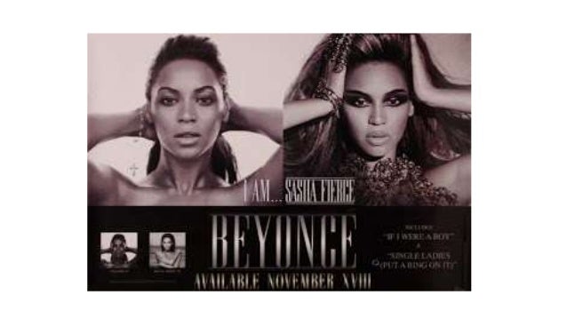
This is the advert for Beyonce "I am....Sasha Fierce" album. There are two images, both of beyonce but with different dennotations. In one image, she is bare-faced with minimal makeup, her hair is pulled back and she has a cross dangling around her wrist. She appears very simple and natural. In the second images, her hands are positioned beside her head, she has gold jewellery on her fingers. She is also wearing gold-plated clothing and she has heavy makeup.
 In one image she appears possessive, powerful and dominant whereas in contrast, in the other image she appears vulnerable. This reinforce's Beyonce's powerful yet vulnerable character to her audience and fans. The text denotes "If I were a boy" and "Single Ladies", which are two of her hit songs. The text reinforce's the idea of beyonce having two persona's, the song If I were a boy describes how Beyonce feels as if there are double standards for males in today's society and how her insecurities are overlooked because she is female ("If I were a boy i think I could understand, how it feels to love a girl....) whereas Single Ladies is about female independence ("don't pay him any attention"). This conforms to the initial idea that Beyonce is fierce yet has an inner weakness. She also has two names on the advert, the subheading denotes "I am.....Sasha Fierce" and the main heading says Beyonce,
 The release date is clearly labelled on the advert "available november XVIII". In the corner it also shows two further album covers, which is useful for promotion and also encourages previous audiences who may have enjoyed her previous albums to buy the upcoming one.
This is the advert for Drake "Take Care"
The Heading denotes "Drake" in large, bold white writing which takes up almost a third of the poster this is useful in enticing the target audience, it makes it clear to the audience that he is the main focus and demonstrates his star persona.

His album cover is denoted in the centre of the image, which is helping the audience understand the main purpose of the advert; to sell his album. It also helps them to identify the album as drake's if they see it in stores, as the actual album cover doesn't have his name on the front. In the album cover, drake is denoted sitting down in a brown room with gold/brown paintings. He is wearing a black shirt and gold chain and is denoted holding a gold cup. The constant reinforcement of the colours gold, brown and black are significant as they connote wealth which gives the audience clues about his financial status and social class, and also portray him as the "conventional rapper" as rappers are often seen wearing heavy gold chains.
 The subtitle denotes "Features include make me proud including nicki minaj, plus guests rihanna and lil wayne". This is useful in attracting other audiences, artists such as Rihanna, Nicki Minaj and Lil wayne may have slightly different audiences and fans and so collaborating with Drake assists him in gaining wider attention and as a result gains the institution sales. The album cover is simplistic whist it representing Drake's wealth, it uses dull colors and drake is sitting down with his head down and the writing is simply white, this allows drake to appear real instead of for example having bright colors, flashy cars and bright writing.

This is the magazine advert for the album "Loud" by rihanna.
 The typography reads Rihanna's name in large white writing, the name of the album "Loud", the release date and the hit's from the album. Her name is placed at the top to draw attention to it, however the writing is very faint and is even smaller than the the name of the album. This connotes that as rihanna is such a huge icon, there is no need to place a large amount of emphasis on her name as people can already recognise her simply from the image. It also makes the poster look subtle and timeless.
Rihanna herself is denoted with a bright red, short, wavy bob with dark shades on, a brown fur coat and a pink rose ring on her finger. The color red is often associated with lust, passion and sexuality which may attract a further male audience and conforms to the theory of the male gaze. Her hair takes up the majority of the advert and it also makes the poster more eye-catching which is useful in capivating the eyes of people and may make them more inclined to purchase her album.
 The use of colours such as pink, red and brown also make the advert look very feminine and is useful for attracting female audiences.
 The shades covering her eyes allow her to appear classy yet mysterious she is denoted holding her hands to her lips which connotes that she is in deep thought. Her costume choice such as her ring and her fur connote wealth.
 The typography reads the name of two of her hit songs "Love the way you lie" and "Only girl in the world", providing her fans with this information may make them more likely to buy her album if they have heard and enjoyed these two songs before, and may make them more convinced that there are further good songs on this album. At the bottom she also includes a picture of what the album actually looks like, this will help her fans to know what to look for in stores.
 The analysis of these three video's has inspired me as I also intend on creating a magazine advert for the waiting game by Luke Christopher.
Subscribe to:
Posts (Atom)
-
These are the lyrics to the song titled "Rihanna" by artist Yxng Bane. He describes the meaning of the song as him "just pa...
-
This is an embedded <a target='_blank' href='https://office.com'>Microsoft Off...
